Qwertys

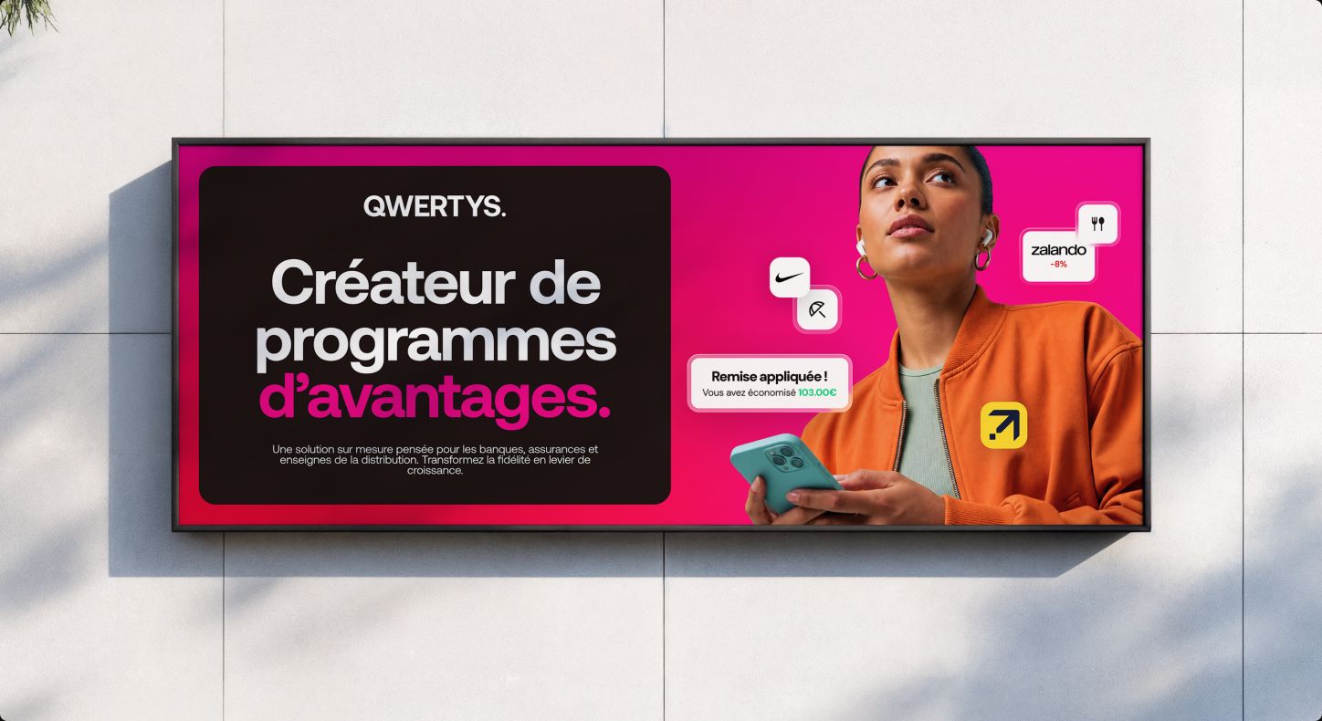
Qwertys billboard "Créateur de programmes d'avantages" on a tiled wall

Qwertys designs tailor-made loyalty and rewards programs for banks, insurers and retailers, turning customer loyalty into a lever for growth.

The new identity is built around a confident wordmark and its “Q.” monogram, a vibrant pink-to-carmine gradient and the Aeonik typeface — bold enough for billboards, clear enough for dense product interfaces.

The system was rolled out across the website, the white-label rewards platforms, social media, out-of-home campaigns and event materials, all documented in shared brand guidelines.
Qwertys wordmark in white on a pink-to-red gradient
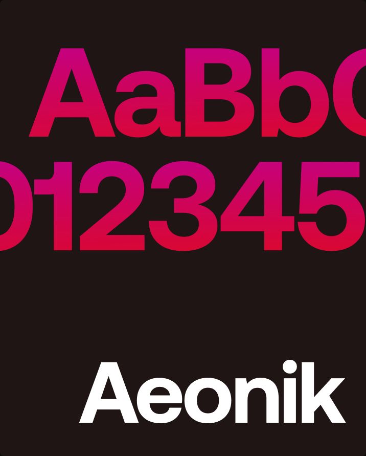
Aeonik typeface specimen — letters and numbers in a pink gradient
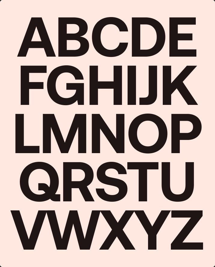
Uppercase alphabet set in Aeonik on a peach background
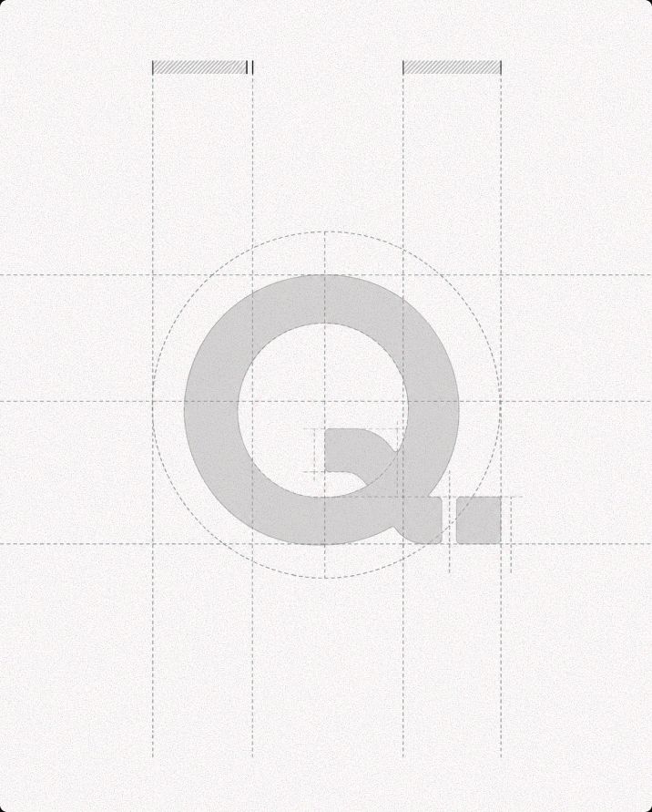
Construction grid of the Qwertys "Q." monogram
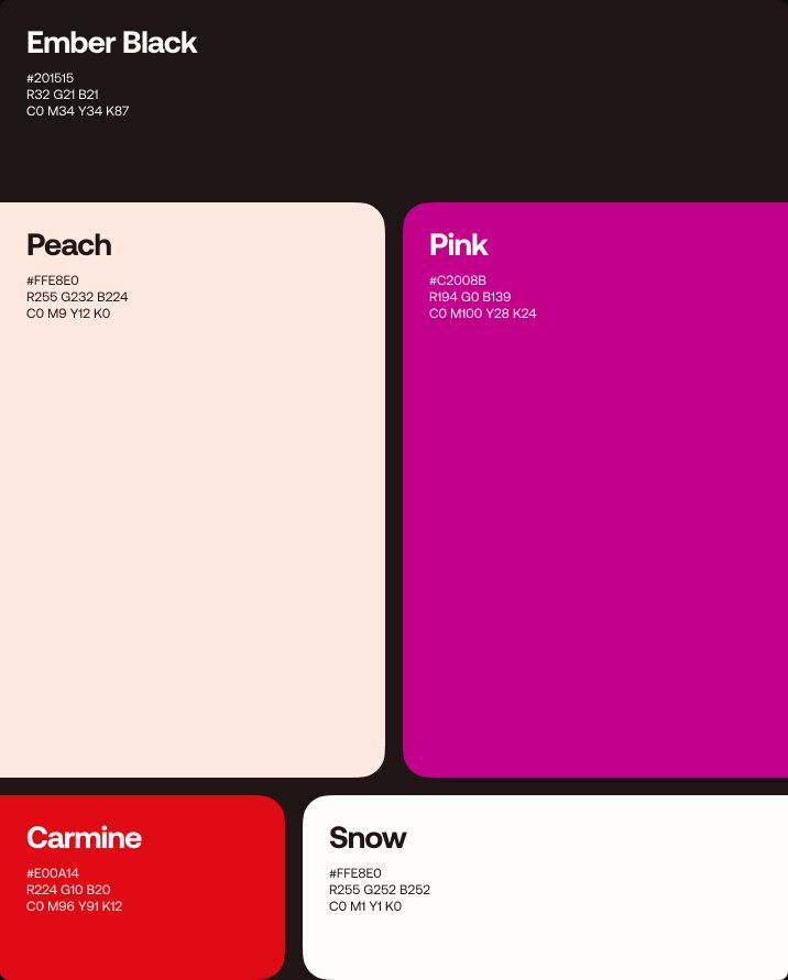
Color palette — Ember Black, Peach, Pink, Carmine and Snow
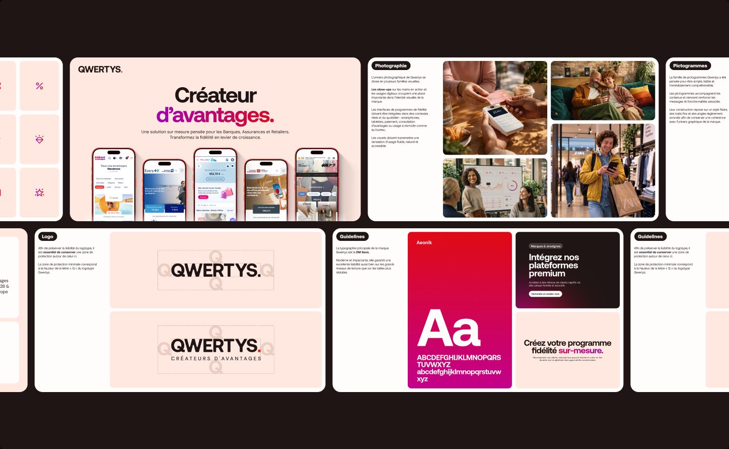
Brand guidelines slides — logo
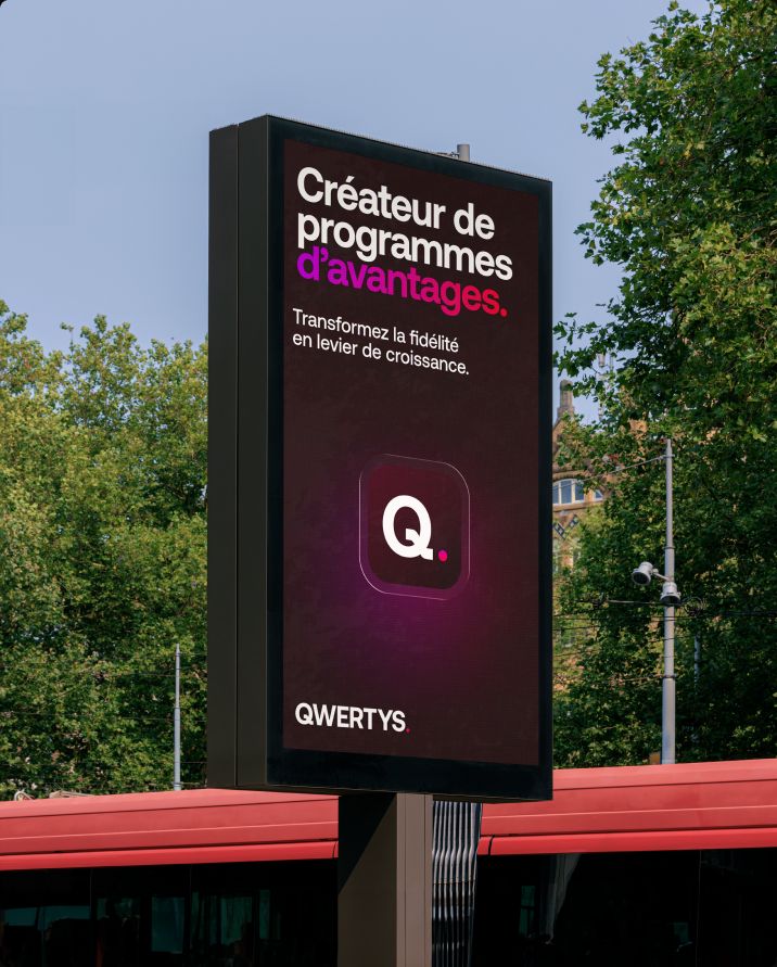
Street poster with the Qwertys campaign and app icon
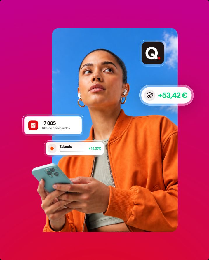
Woman holding a phone surrounded by cashback and order UI cards
Large Qwertys lightbox in a dark industrial space
Man smiling at his phone while shopping with bags in hand
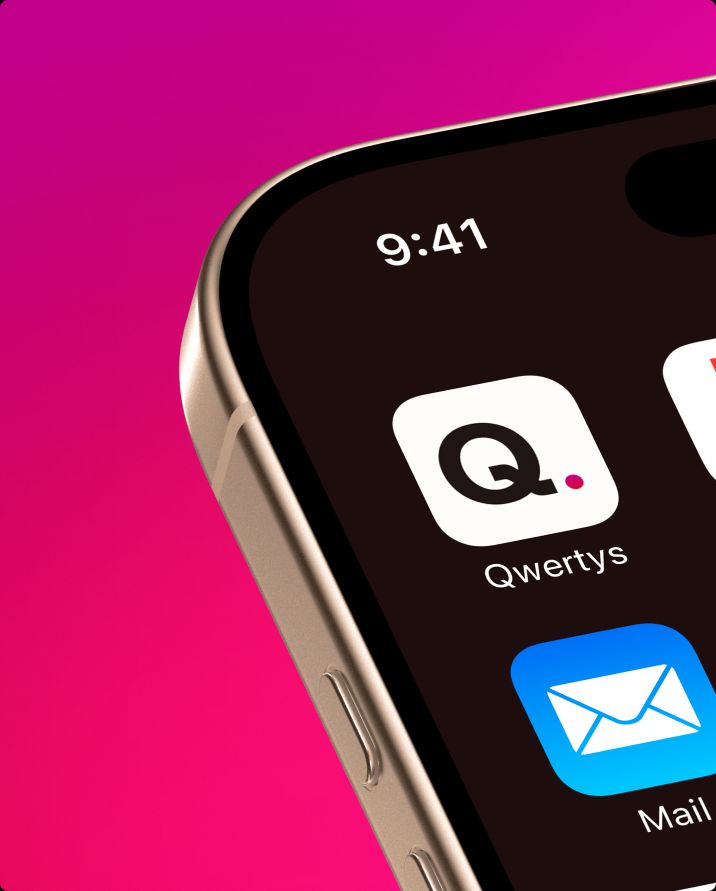
Close-up of the Qwertys app icon on a phone home screen
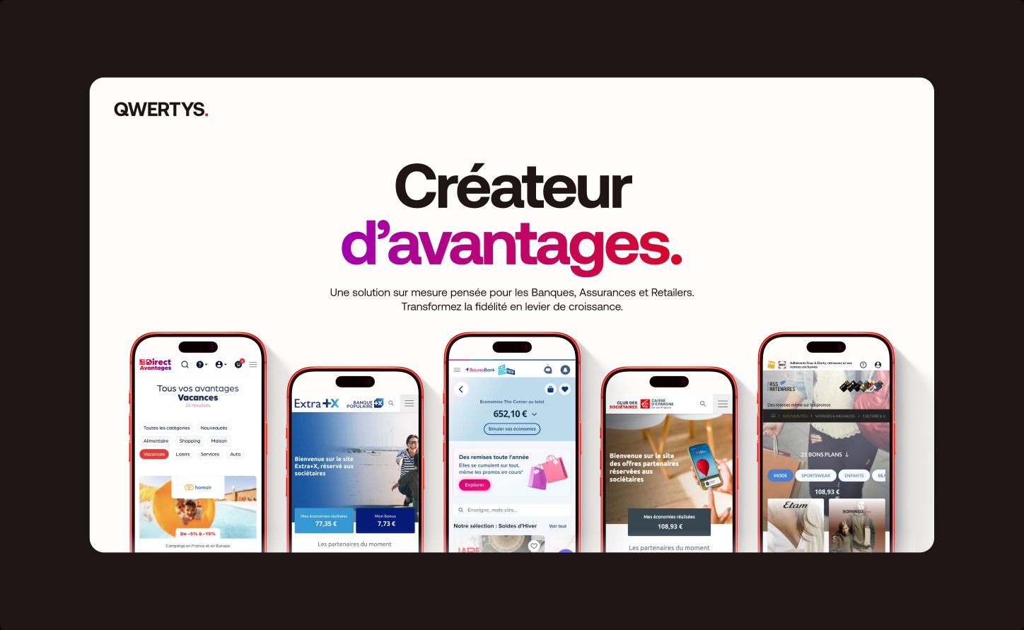
Website hero with five phones showing white-label rewards platforms
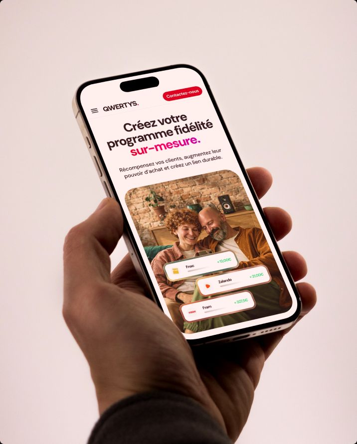
Hand holding a phone with the Qwertys mobile website
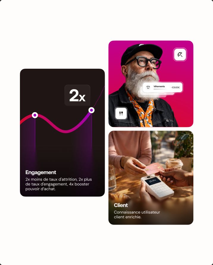
Key figure cards — engagement chart and customer insights
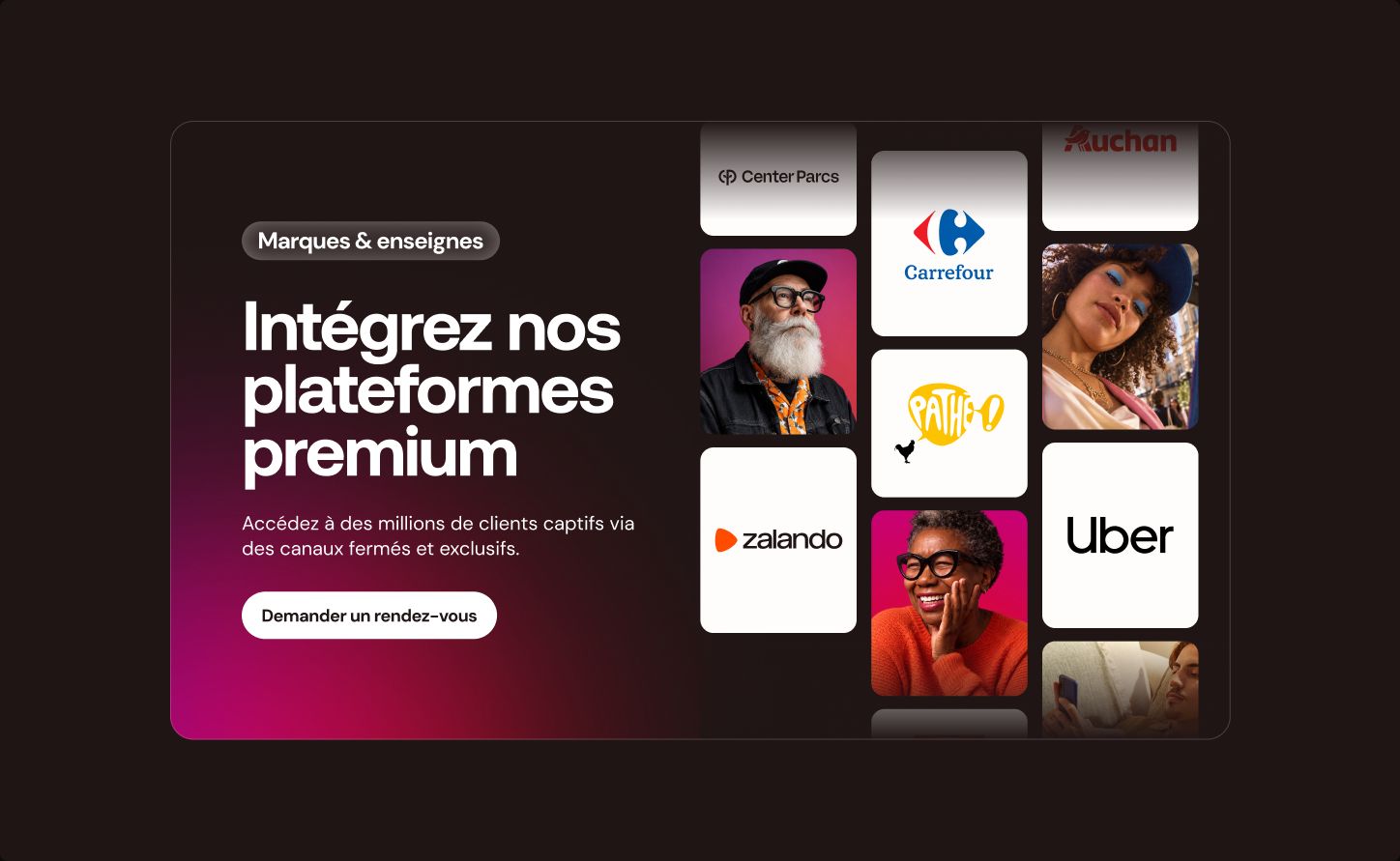
Partner brands banner: Intégrez nos plateformes premium
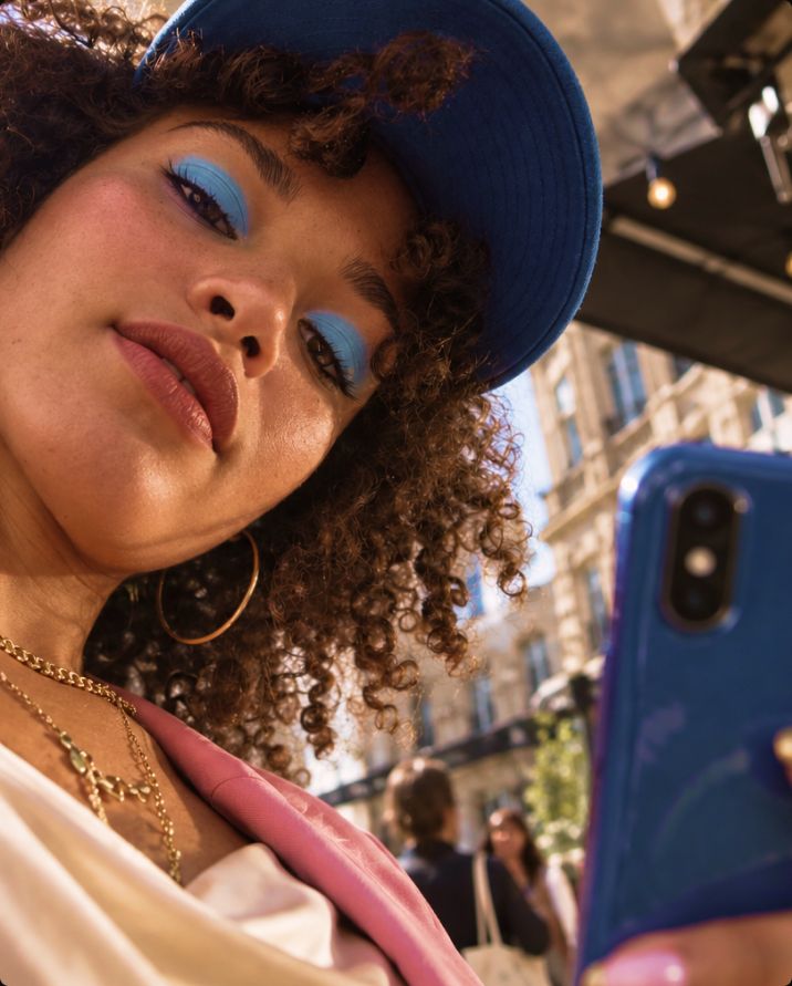
Young woman looking at her phone in the street
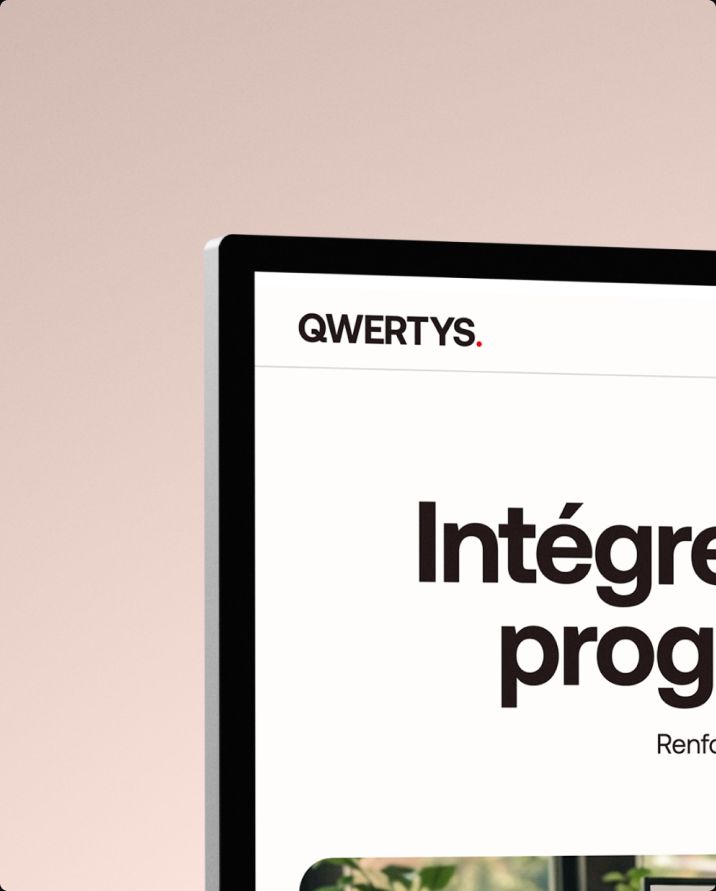
Desktop screen showing the Qwertys website header
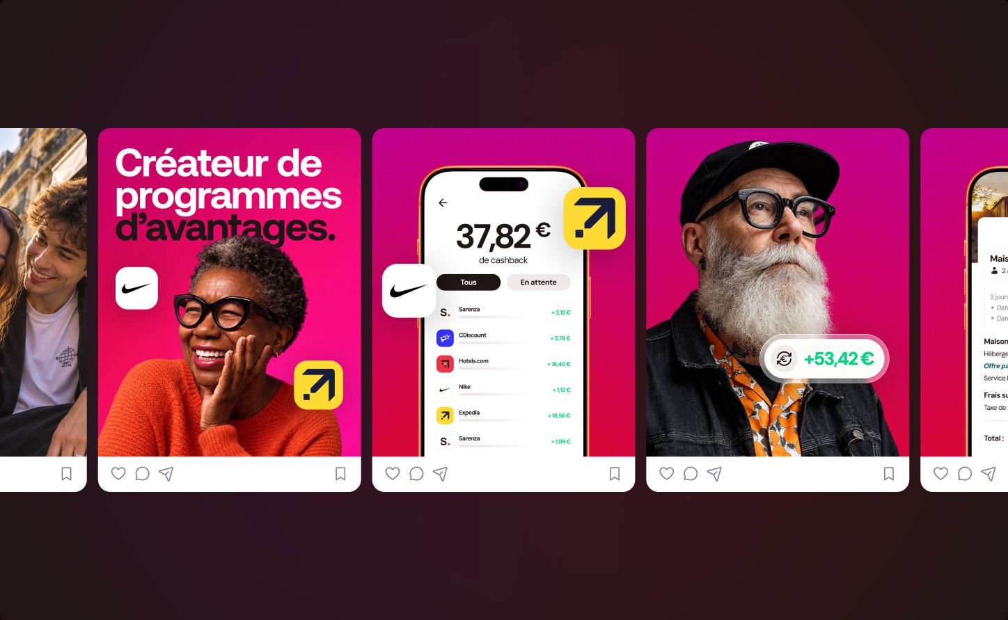
Series of Qwertys social media posts
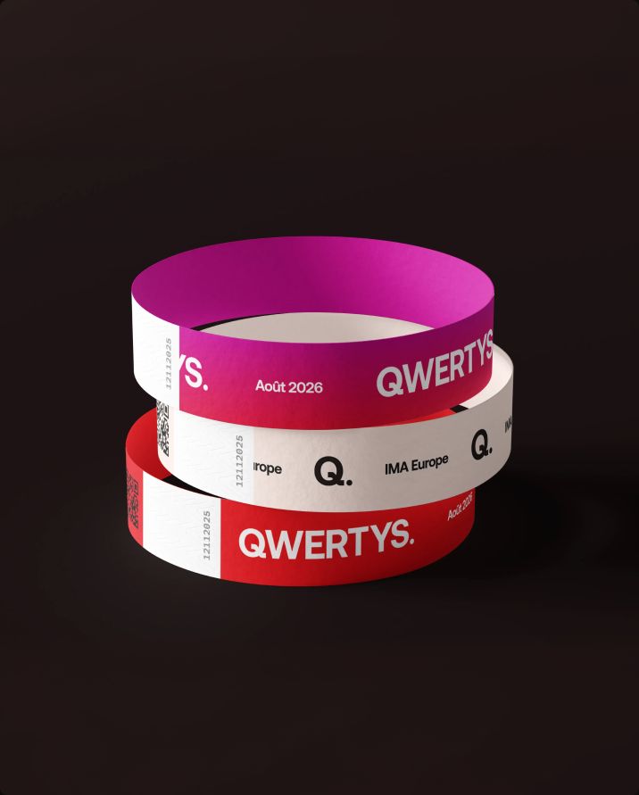
Stack of Qwertys event wristbands in pink
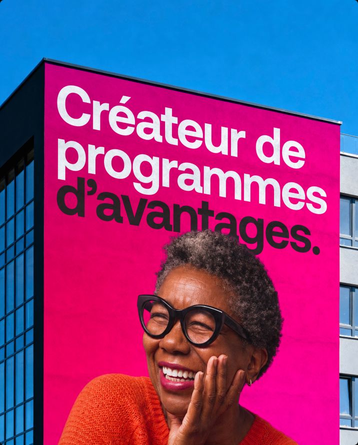
Giant Qwertys campaign poster on a building facade